
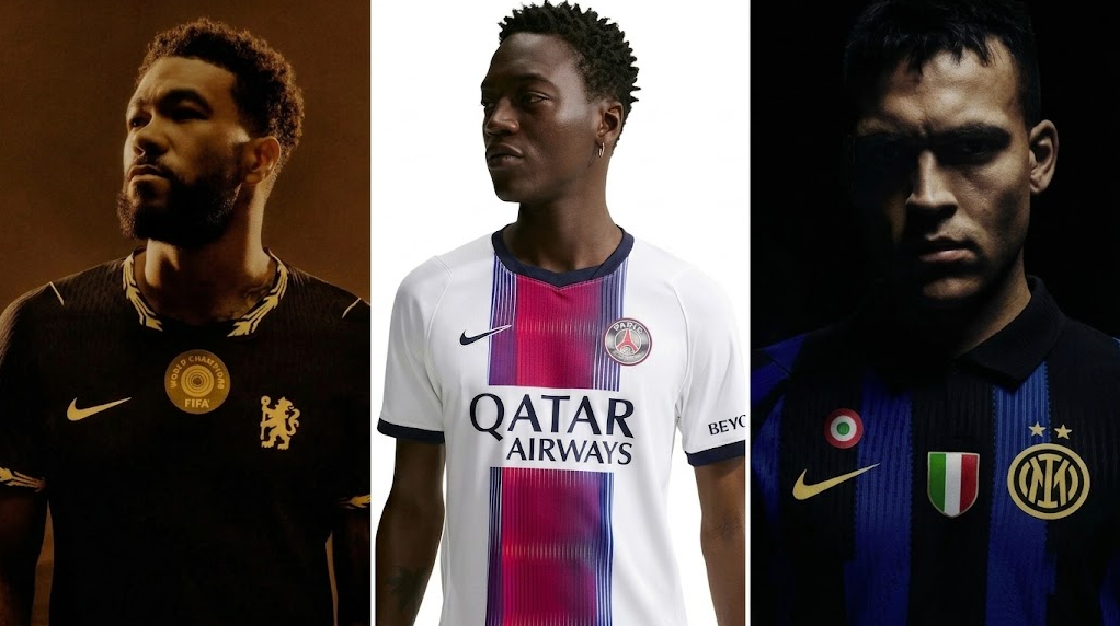
2026/27 soccer jerseys are proving that a new kit does not need a completely unfamiliar identity to feel fresh. Three club announcements point to the season’s clearest direction: designers are returning to recognizable colours and historic references, then sharpening them with controlled graphics, collars and small metallic accents. Chelsea, Paris Saint-Germain and Inter each take a different route, but together they show how heritage can be edited rather than simply repeated.
This guide focuses on verified design information from the clubs themselves. It also separates those official design stories from the products listed by New York Soccer Shop. A store listing can help shoppers compare colour, cut and styling, but it does not imply club authorization, licensing, endorsement or partnership.
Trend 1: Heritage is becoming more selective
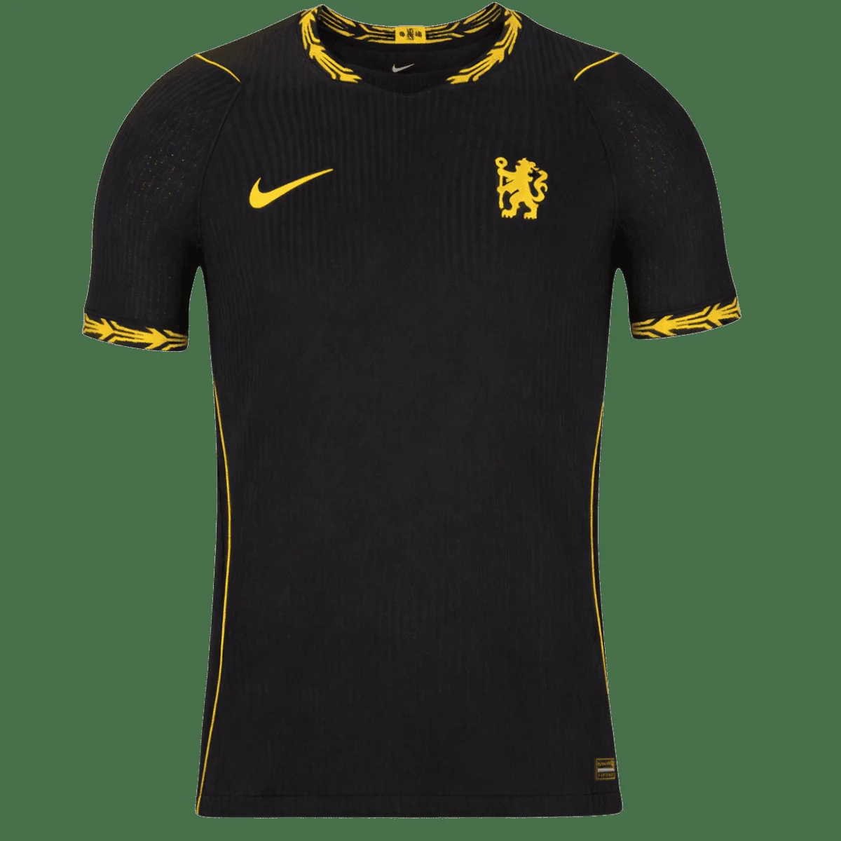
Chelsea’s official 2026/27 away-kit announcement confirms a black base and the return of yellow to the club’s away palette for the first time since 2021/22, expressed in a warm “Midwest Gold” tone. The club also describes a laurel-wreath motif around the neck and sleeve cuffs, plus engineered gold ribs across the shoulders. The important trend is not simply “retro.” It is selective memory: one familiar colour relationship is brought back, while a limited set of details connects the shirt to the current season.
That approach makes a jersey easier to style beyond matchday. Black controls the visual weight, and gold works as an accent instead of competing across the full shirt. For shoppers, this means the colour can be the first filter. If a jersey already works with jeans, dark trousers and neutral sneakers, it is more likely to remain useful after the opening weeks of the season.
Trend 2: Central graphics are creating movement
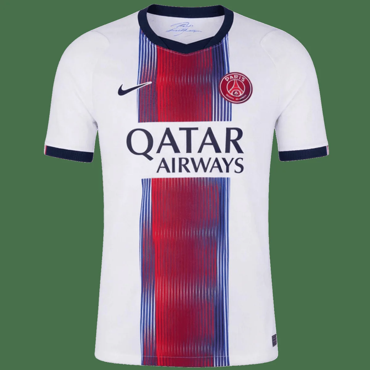
Paris Saint-Germain describes its 2026/27 away design as a white silhouette organized around the club’s central stripe. Fine vertical lines move from red toward navy, creating a sense of rhythm and motion. The club also highlights a crest treatment that changes colour by viewing angle. Even without focusing on technical construction, the visual lesson is clear: narrow repeated lines can make a traditional central panel feel active rather than static.
This kind of design rewards a little distance. Up close, the fine lines provide texture; farther away, they merge into a stronger central block. It is also naturally flattering because the eye follows a vertical path. Fans choosing between a close player-style cut and a regular fit should still compare measurements, but the graphic itself can make both silhouettes appear more streamlined.
Trend 3: Tailoring details are returning
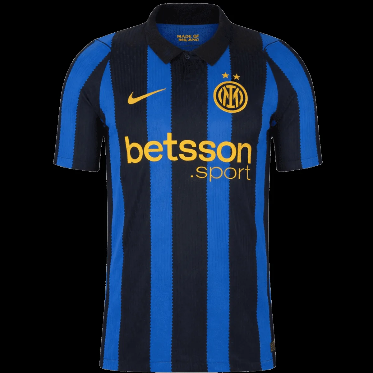
Inter’s official home-kit release combines black with Lyon Blue and says the palette pays tribute to the club’s 1998 shirt. University Gold details reference the yellow used on that earlier design. The collar returns, while the edges of the stripes take inspiration from the cut of tailor’s scissors—a direct connection to Milan’s manufacturing and fashion identity. Here, heritage is not only a colour reference; it is expressed through construction cues.
A collar changes how a football shirt sits under a jacket or overshirt. It gives the neckline more structure and can make the jersey feel closer to a polo. Irregular or cut-inspired stripe edges then stop the traditional black-and-blue pattern from looking like a simple archive copy. This mix of order and disruption is likely to appear across more 2026/27 designs.
How to choose among the new designs
- Start with wearability: choose a palette that fits at least three outfits you already own.
- Check the cut: player-style jerseys normally sit closer to the body; size up if you prefer a relaxed shape or plan to layer.
- Inspect the detail level: a bold graphic photographs well, while a restrained design may be easier to wear weekly.
- Confirm customization: verify spelling, number and return conditions before ordering a personalized item.
Care matters too. Turn the jersey inside out, wash it cold with similar colours and air dry it. Avoid bleach, fabric softener, tumble drying and direct heat over prints. Small details are doing more work in this season’s designs, so protecting collars, cuffs and applied graphics helps preserve the intended look.
The season’s bigger design message
The most interesting 2026/27 soccer jerseys are not choosing between history and modernity. They are using history as a design constraint: one colour, one shape or one cultural detail becomes the anchor, while new graphics and fabrics update the result. For fans, that makes comparison more useful than chasing every launch. Look closely at the palette, neckline, stripe treatment and cut, then choose the shirt that will still make sense in your wardrobe after the first matchday.